Abstraction
SYLLABUS FOCUS: Structural Frame, Subjective Frame, critical practice
Abstraction is a general term for non-representational art. While it suggests an absence of subject, it in fact allows for multiple interpretations. Generally seen as deriving from the Modernists’ pursuit of the avant-garde and the growing interest in ‘art for art's sake’, abstraction can be approached from both the Structural and Subjective Frames. But abstraction is not confined to such artists as Kandinsky and Miró (Subjective Frame) or to Malevitch and Mondrian (Structural Frame). It is seen in the large canvases of the American Abstract Expressionists, but it is also a major component in contemporary artmaking practice.
Abstraction is a general term for non-representational art. While it suggests an absence of subject, it in fact allows for multiple interpretations. Generally seen as deriving from the Modernists’ pursuit of the avant-garde and the growing interest in ‘art for art's sake’, abstraction can be approached from both the Structural and Subjective Frames. But abstraction is not confined to such artists as Kandinsky and Miró (Subjective Frame) or to Malevitch and Mondrian (Structural Frame). It is seen in the large canvases of the American Abstract Expressionists, but it is also a major component in contemporary artmaking practice.
Mark Rothko
(1903–1970, Russian, moved to United States in 1913)
Issues/interests: abstraction (non-representational art) using the expressive power of colour alone
Forms: watercolour, acrylic and oil painting
Frames: Subjective — meditative, creates personal, emotional and spiritual response from the viewer; Structural — developed his own visual language, relying on balance and tension between colour and surface qualities
Conceptual Framework: The link between Rothko the artist and how he wished his audience to view his work was very strong. He demanded control of where and how his works were hung, particularly the lighting conditions. He also disliked showing his works alongside anyone else's and would not sell his work unless he could control how it would be seen. Rothko's use of powerful colour, monumental scale and a contemplative quality demands the spectator's participation in the work.
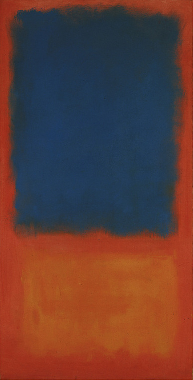
The blue ‘rectangle’ in Untitled 1955 (below) has an imposing weight and seems to be compressing the thin area between it and the hovering rectangle of yellow wash below, as if falling in space. The reaction between the principal colours, blue and orange, is vibrant (they are, after all, opposing colours on the colour wheel). There is a feeling of impermanence, of matter being transformed, the edges of the shapes dissolving or melting as they react with the outer areas. The difference in intensity of colour between the background and lower shape is subtle, enhancing the sense of mystery or of the metamorphosis of matter. Our eyes perceive change, small optical tricks occurring as we focus on different areas: space recedes, radiant colours advance, while we become aware of the slight variations in colour and texture, particularly at the edges. Colour is used in an emotive way to draw the viewer into an almost meditative state.
Untitled 1955 (above)
acrylic and mixed media on canvas
The Israel Museum, Jerusalem
Gift of the Mark Rothko Foundation/The Bridgeman Art Library
© Mark Rothko/ARS
Licensed by Viscopy, 2010
Issues/interests: abstraction (non-representational art) using the expressive power of colour alone
Forms: watercolour, acrylic and oil painting
Frames: Subjective — meditative, creates personal, emotional and spiritual response from the viewer; Structural — developed his own visual language, relying on balance and tension between colour and surface qualities
Conceptual Framework: The link between Rothko the artist and how he wished his audience to view his work was very strong. He demanded control of where and how his works were hung, particularly the lighting conditions. He also disliked showing his works alongside anyone else's and would not sell his work unless he could control how it would be seen. Rothko's use of powerful colour, monumental scale and a contemplative quality demands the spectator's participation in the work.
The blue ‘rectangle’ in Untitled 1955 (below) has an imposing weight and seems to be compressing the thin area between it and the hovering rectangle of yellow wash below, as if falling in space. The reaction between the principal colours, blue and orange, is vibrant (they are, after all, opposing colours on the colour wheel). There is a feeling of impermanence, of matter being transformed, the edges of the shapes dissolving or melting as they react with the outer areas. The difference in intensity of colour between the background and lower shape is subtle, enhancing the sense of mystery or of the metamorphosis of matter. Our eyes perceive change, small optical tricks occurring as we focus on different areas: space recedes, radiant colours advance, while we become aware of the slight variations in colour and texture, particularly at the edges. Colour is used in an emotive way to draw the viewer into an almost meditative state.
Untitled 1955 (above)
acrylic and mixed media on canvas
The Israel Museum, Jerusalem
Gift of the Mark Rothko Foundation/The Bridgeman Art Library
© Mark Rothko/ARS
Licensed by Viscopy, 2010
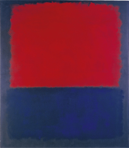
Here the roles are reversed compared with the previous work: the blue at the bottom miraculously has less ‘power’ than the red. This highlights how colours are affected by surrounding colours, position and
distance. The dark grey seems to have drained the light out of the blue, whereas the red hovers on top, the more brilliant because of glimpses of the contrasting dark hue behind. Is the colour spreading out or receding? As with most of Rothko's work, a gentle movement is implied, a straining of dominance, an alluring tension that allows our mind to empty of everyday thoughts, to bring
self-awareness and contemplation of life's bigger issues.
Number 207 (Red over Dark Blue on Dark Gray)
1961
oil on canvas
235.6 × 206.1 cm
University of California, Berkeley Art Museum and Pacific Film Archive. Museum purchase
Photo: Benjamin Blackwell
© Mark Rothko/ARS Licensed by Viscopy, 2010
Historical background — biography
Mark Rothko (born Marcus Rothkovich) moved to the United States in 1913, at the age of 10. Between 1921 and 1925 he studied at Yale University and the Art Students League, New York. He was interested in mythology and Jungian theory and did research in colour. He was the leading colour field painter (others include Clyfford Still and Barnett Newman) of the Abstract Expressionist school. In 1960 the first permanent, public Rothko Room was created in the Phillips Collection, Washington. From 1965 to 1967 he worked on a set of paintings for the de Menil family to hang in the chapel of the Institute for Religion and Human Development, Houston, Texas. In 1970 Mark Rothko took his own life by opening his veins with a razor and taking an overdose of barbiturates.
Artist's practice
Choices/intentions/techniques
Rothko's early paintings in the 1930s were expressionistic in style, the subjects generally within the conventions of the nude, everyday life, landscape, street scenes and interiors. The works were of contemporary life but contained a feeling of tension. His first one-man show, in 1933, was at the Contemporary Arts Gallery, New York. He became interested in Greek, Jewish and Christian myths.
In the early 1940s Rothko, like many of his contemporaries such as Ashile Gorky, experimented with automatism and Jungian philosophy, leading to his Surrealistic biomorphic paintings of 1942 to 1947. These
linear, symbolic motifs gave way to pure abstraction. In a world still reeling from World War II and murderous racism as well as global destruction, the realistic image held too much pain of association for many
artists, who sought the inner world, the subconscious or the expression of ideas of universal significance through abstraction. Rothko sought a simpler expression of his feelings and complex thoughts on the
universality of humanity. He now expressed physical conflict in terms of colour, texture and the division of the canvas into large floating rectangles of colours. Rothko began reducing the titles of his works to the barest
description, identifying them with a number or colour. At the same time he increased the size of his canvas to create an intimacy with the viewer. Rothko believed in an immediate transaction between painting and viewer: it takes you into it. He referred to his paintings as ‘dramas’, stating that the ideal distance from which to view them, to feel their inner movement, discern the luminosity of the colour and experience a sense of awe, was 45 centimetres. In 1949 he established his signature form, and, with minor variations, his best-known abstract works would continue to use soft-edged rectangular areas of powerful colour directly applied to raw canvas. There is no central point of attention. His rectangles fill the picture space, and the texture of the canvas shows through the washes of colour, acting as a unifier.
Rothko focuses on spatial relationships, and the weight and emotive power of colour. The weight of colour itself becomes the only structure in the paintings. The relationship between the colours sets up a rhythmic pulsation. Red, with its elemental power and symbolic emotional effect, dominated his palette in the
1950s. He built up the intensity of his surface by staining the canvas (similar to the technique of using watercolours on paper), scumbling it as he applied successive layers of thin pigment wash. Warm colour is soaked over cool, cool over warm, light over dark or dark over light. These roughly rectangular shapes (usually two or three) are stacked vertically, one on top of the other, with intervals in between creating ambiguous depth that suggests horizons, mists or cloud banks. There is thus a link to landscape or even the architectural
division of space of subways and street scenes; so although abstract these works carry implications of meaning. The works had an architectural feel, the rectangles placed vertically suggesting columns or windows, giving a mood of confinement.
Rothko, like Kandinsky, wanted to give painting the same kind of expressive power as music or literature (there is a link here with the philosopher Friedrich Nietzsche, who believed music was the true language of emotion). Rothko was greatly inspired and consoled by listening to music. He was particularly concerned with controlling the display of his work, recognising that context and the way an artwork is displayed can affect its meaning or emotional effect. He always preferred to hang the paintings and arrange the lighting himself in exhibitions, insisting on muted illumination, which he felt added a mysterious quality to his works. This at times caused tension between the artist and galleries and their curators. A plan to send his work on a
European tour, after the 1952 Fifteen Americans exhibition at the Museum of Modern Art, was cancelled due to Rothko's objections. With the Rothko Room in the Phillips Collection, Washington DC in 1960, he was finally able to realise his dream of controlling the room in which his works hung, creating a space in which the viewer could experience his paintings as a series on a physical as well as an emotional level.
These large masses of luminous, vibrant colour that merge into or hover over one another overwhelm the viewer. His colour evokes mood; his reds can be either dark and oppressive, suggesting death, or light, suggesting blood or flames; his blues suggest mists or empty places; his yellows create a more buoyant feeling. This pure type of painting, whose colours seem to emit an inner glow, is expressive yet holds a sense of the mystery of divine power, inviting a contemplative state. The works are at once overbearing
yet lyrical, imbued with a timeless quality but with a hint of the tragic — a sense of impending doom, suspended at the point of transformation, or instability, like the sky before a storm. The tension between colour areas seems to hold each colour in check; in other paintings the vibrating colour areas are pulled apart by the outside colour frames. Both result in an electrifying tension or suspense — what Rothko has referred to as ‘violence’.
Rothko believed that art must reach out to deep spiritual levels. His works expressed his ideals with passion and emotional intensity. The colour became progressively darker and the bright, blazing colours gave way to sombreness, hinting at Rothko's growing pessimism and poor health.
Technique
Rothko painted on untreated (unprimed) canvas, first brushing a thin layer of binder into which he had mixed colour pigments. He fixed this foundation with oils, allowing them to spread around the unframed edges of his canvases. He then applied thin, almost transparent colour, allowing the luminance of the colour below to shine through. He applied these individual layers of paint with very light and fast brushstrokes.
Conceptual Framework
With Modernism, and particularly Rothko's Abstract Expressionist art, there was a change in the relationship between artwork and viewer.
Artist's statements
‘We [Abstract Expressionists] favour the simple expression of the complex thought. We are for the large shape because it has the impact of the unequivocal [certain, unquestionable]. We wish to reassert the picture plane. We are for flat forms because they destroy illusion and reveal truth.’ (1943)
‘Today the artist is no longer constrained by the limitation that all of man's experience is expressed by his outward appearance. Freed from the need of describing a particular person, the possibilities are endless. The whole of man's experience becomes his model, and in that sense it can be said that all of art is a portrait of an idea.’ (1943)
‘I paint very large pictures. I realise that historically the function of painting large pictures is something very grandiose and pompous. The reason I paint them however … is precisely because I want to be very intimate and human. To paint a small picture is to place yourself outside your experience, to look upon an experience as a stereopticon view or with a reducing glass. However you paint the larger picture, you are in it. It isn't something you command.’ (1951)
‘It was with the utmost reluctance that I found the figure could not serve my purposes … But a time came when none of us could use the figure without mutilating it.’ (1958)
From catalogue to exhibition Mark Rothko 1903–1970, 17 June – 31 August 1987, Tate Gallery Publications, London.
‘The abstract artist has given material existence to many unseen worlds … For art to me is an anecdote of the spirit, and the only means of making concrete the purpose of its varied quickness and stillness.’
Rothko speaking at the David Porter Gallery, Washington, 1945, reprinted in Mark Rothko (exhibition catalogue), Galerie Beyeler, Basel, 1990.
‘You might as well get one thing straight. I'm not an abstractionist … I'm not interested in the relationship of colour to form or anything else. I'm interested only in expressing basic human emotions — tragedy, ecstasy, doom and so on. And the fact that a lot of people break down and cry when confronted with my pictures shows that I communicate those basic human emotions … The people who weep before my pictures are having the same religious experience I had when I painted them. And if you, as you say, are moved only by their colour relationship, then you miss the point.’
Rothko, Jacob Baal-Teshuva, Taschen, 2003, pp. 50–7.
**Rothko increasingly refused to be identified with the New York School. He hated just as much to be classified as a great colourist, as indicated in this extract from an interview with Selden Rodman.
Historical practice
‘The artist has abandoned the illusions of three-dimensional recession; there is not even the space between various overlaid brush-strokes. The surface texture is as neutral as possible. Seen close up and in a penumbra [partial shadow], as these paintings are meant to be seen, they absorb, they envelop the viewer. We no longer look at a painting as we did in the nineteenth century; we are meant to enter it, to sink into its atmosphere of mist and light or to draw it around us like a coat — or a skin.
‘But to repeat, they also measure the spectator gauge him. These silent paintings with their enormous, beautiful, opaque surfaces are mirrors, reflecting what the viewer brings with him. In this sense,
they can even be said to deal directly with human emotions, desires, relationships, for they are mirrors of our fantasy and serve as echoes of our experience.’
Peter Selz, Mark Rothko, Museum of Modern Art, New York, 1961, pp. 9–10.
‘Rothko, like several other leading American artists of the post-war period — Gorky, de Kooning, Hofmann — was born abroad; he came to America from Russia in 1913, when he was 10. He began as an expressionist, felt the influence of Matta and Masson, and followed the standard pattern by having an exhibition at the Art of This Century Gallery in 1948. Gradually his work grew simpler, and by 1950 he had reached the point where the figurative element had been discarded. A few rectangles of space are placed on a coloured ground. Their
edges are not defined, and their spatial position is therefore ambiguous. They float towards us, or away, in a shallow space of the kind that we also find in Pollock — it derives, ultimately, from the spatial experiments of the Cubists. In Rothko's paintings the colour relationships, as they interact within the
rectangle and within this space, set up a gentle rhythmic pulsation. The painting becomes both a focus for the spectator's meditations and a screen before a mystery. The weakness of Rothko's work (just as the subtlety of colour is its strength) is to be found in the rigidity and monotony of the compositional formula. The bold central image became one of the trademarks of the new American painting — one of the things that differentiated it from European art. Rothko was an artist of real brilliance imprisoned in a straitjacket; he exemplifies the narrowness of focus which many modern artists imposed upon themselves.’
Edward Lucie-Smith, Movements in Art since 1945 (new rev. edn), Thames and Hudson, London, 1984, p. 42.
http://www.nga.gov/feature/rothko/ - ROTHKO LINK
http://www.tate.org.uk/context-comment/video/tateshots-rothko - Tate Modern Rothko Exhibition
SHORT RESPONSE QUESTION
Both critics and art historians provide information about artworks and artists, but their approach, viewpoint and language differ. Explain the role of the art historian by analysing the writing on Rothko by Edward Lucie-Smith.
Answer this question on the virtual classroom discussion board. The answer will contribute to review grades.
Jackson Pollock
(1912–1956, American)
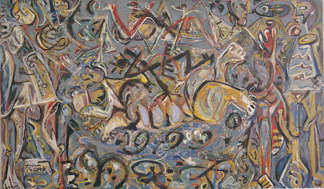
Pasiphaĕ 1943
oil on canvas
142.6 × 243.8 cm
The Metropolitan Museum of Art Purchase, Rogers, Fletcher, and Harris Brisbane Dick Funds and Joseph Pulitzer Bequest, 1982, accn no. 1982.20
The Metropolitan Museum of Art, New York Image
© The Metropolitan Museum of Art/Art Resource, NYC
© Pollock-Krasner Foundation
Licensed by ARS, New York & Viscopy, Australia
Issues/interests: abstraction, self-identity, personal language, art as extension of self or as an inner necessity
Frames: Subjective in emotional intensity and personal language; Structural in use and development of personal symbols and innovative methods
Conceptual Framework: There was a close involvement between the artist and the artwork, the whole body being used in its execution. Pollock widened the methods of artmaking and the notion of the art object. By looking at the role critics played in promoting Pollock's reputation, we also consider the agencies of the artworld.
In Pasiphaĕ 1943 (above) the mood is of mystery, perhaps anger. The sombre colours and heavy black lines add to the feeling of aggression and confusion. Fragments of feet, ribs and legs are scattered across the painting, but it is hard to decipher if they are animal or human. They seem to operate as symbols rather than telling a story or representing reality. One can see the logical progression from this work to the abstraction of his later work. There is a richness to the surface, with layers of colour applied thickly. Colours appear to be smeared together rather than blended, with patterns of lines sitting on top, adding to the sense of frenzy and denseness of the work. The painting seems to extend beyond the frame, yet there is a subtle focus in the centre caused by the hint of an oval shape and the intensity of the black jagged lines.
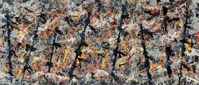
Blue Poles 1952
oil, enamel, aluminium paint, glass on canvas
212.1 × 488.9 cm
National Gallery of Australia, Canberra
Purchased 1973
© Pollock-Krasner Foundation
Licensed by ARS, New York & Viscopy, Australia
In Blue Poles (above) the ‘poles’ create a secondary rhythm across the myriad spidery lines and the feeling of frenzy below. Had the poles been arranged regularly in a parallel row, the effect might have to produce a sense of order. Pollock instead suggests another, more disquieting narrative, or level of consciousness, while at the same time creating places of rest for the viewer. The composition is still open, however, the ‘action’ seeming to continue off the picture plane, engulfing and intriguing the viewer who has already been drawn into the space by the grand scale of the work and its sense of energy.
Historical background — biography
Paul Jackson Pollock was the youngest of five children of an unsuccessful farmer in a small town in the state of Wyoming. The family moved around various parts of California and Arizona. Partly as a result of this nomadic life, Pollock became interested in Eastern philosophy, Jung and psychoanalysis as a means of exploring his self-identity. After undergoing Jungian analysis his work became more abstract. By 1937 Pollock was drinking heavily and undergoing psychiatric therapy. In 1940 he married Lee Krasner, also an influential abstract painter.
In 1943 art collector Peggy Guggenheim gave him a five-year contract. That November he held his first one-man show at her Art of This Century Gallery. After his one-man show in 1948, Pollock exhibited in 1950 at the Venice Biennale with de Kooning and Gorky. In 1953 he exhibited in Paris and Zurich.
Pollock died in a car crash at the age of 44.
Artist's practice
Influences
In the 1940s Jackson Pollock led the Abstract Expressionism movement that saw New York displace Paris as the world art capital. Pollock's early work was realist, but then he became aware of the work of the Surrealists Miró and Masson and the German Expressionists Klee and Kandinsky. Pollock's greatest influence was Picasso and his idea that conventional rules of painting could be broken.
Pollock generally painted while listening to the music of John Cage, Morton Feldman, Varèse and Stravinsky. He was also influenced by the poems of Dylan Thomas and the psychiatric analysis of C. G. Jung, which he undertook to control his drinking problem. Jung's view was that the unconscious naturally created myths and symbols, which needed to be expressed through art. Jung encouraged the study of primitive art and encouraged artists to turn inwards for inspiration.
Methods/technique
Pollock developed his own semi-figurative language. This led to semi-abstract works based on biomorphic forms related to plants, animals and primitive symbols. Pollock created a sensation internationally with his original action painting technique of laying his large canvases on the floor and walking around them, dripping, splashing and pouring paint. He generally painted when he was in a heightened emotional state, but also when in a state of deep concentration. When Pollock was painting, it was as though he was almost performing a personal ritual, involving himself in the act of moving in free response to his inner needs. The result was expressive yet controlled paintings of swirling, expanding space with intertwining patterns and tangles of lines. The painted surface was now the subject of the art; depth was now not the illusion of space
but the actual build-up of paint.
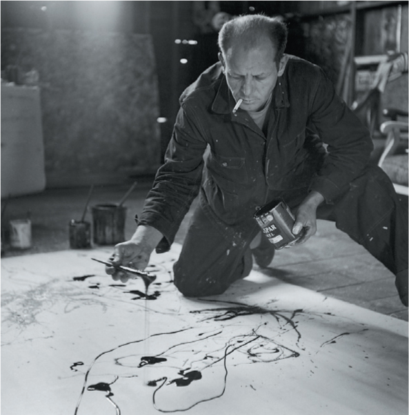
Jackson Pollock at work in his Long Island studio.
Photo: Martha Holmes/Time Life Pictures/Getty Images
Intention/meaning
Pollock's paintings are suggestive of the two sides of his personality, indicating both a wildness and a sensitivity. His works reached total abstraction, with the elimination of any hint of representational forms. He
disregarded the traditional painting rules. With their imposing scale and visual impact, his paintings reflected the vibrancy and vitality of American culture at the time — big Cadillacs, jazz music and the actor James Dean.
Significance
Jackson Pollock's work is the culmination of many of the ideals of Modernism. These include the avant-garde notion of striving to create a new style or approach, which ultimately led to abstraction. It also involved the
notion of ‘art for art's sake’, with its emphasis on the importance of the brushstroke and the quality of the paints themselves, rather than painting to imitate reality. The function of art was extended to include self-expression and the search for understanding of the self. This led to the importance of the gesture and the influence of philosophy and psychology on modern art. Jackson Pollock was one of the first American artists to be recognised internationally as a master of modern art.
Historical practice
‘Jackson Pollock has become the world-wide symbol of the new American painting after World War II … His paintings of the mid 1940s, usually involving some degree of actual or implied figuration, were coarse and heavy, suggestive of Picasso, Max Ernst, and, at times, Miró or Masson, but filled with a nervous, brutal energy of their own. By 1947 — even earlier in his drawings — the artist had begun to experiment with over-all painting, a labyrinthine network of lines, splatters, and paint drips from which emerged the great drip paintings of the next few years. These paintings, generally executed on a large canvas laid out on the floor, are the works most popularly associated with the phrase action painting …
‘Aside from their intrinsic quality, Pollock's drip paintings contributed other elements that changed the course of modern painting. There was, first, the concept of the over-all painting, the painting seemingly without beginning or end, extending to the very limits of the canvas and implying an extension even beyond. This, together with the large scale of the works, introduced another concept — that of wall painting different from the tradition of easel painting, even as it existed in Cubism and geometric abstraction. This was the final break
from the Renaissance idea of painting detached from the spectator, to be looked at as a self-contained unit … although he had no direct stylistic followers, he affected the course of experimental painting after him.’
H. H. Arnason, A History of Modern Painting, Sculpture, Architecture, Thames and Hudson, London, 1985, pp. 523–4.
Critical practice
The Nation, 27 November 1943 (review of exhibition), vol. 1, pp. 165–6
‘The smaller works [including] Conflict and Wounded Animal, with its chalky encrustation, are among the strongest abstract paintings I have yet seen by an American. Here Pollock's force has just the right amount of space to expand in; whereas in larger format he spends himself in too many directions at once. Pollock has gone through the influences of Miró, Picasso, Mexican paintings, and what not, and has come out at the other side at the age of thirty-one, painting mostly with his own brush. In his search for style he is liable to relapse into an influence, but if the times are propitious [favourable], it won't be for long.’
The Nation, 20 January 1945 (review of exhibitions of Edgar Degas and Richard Pousette-Dart), vol. 1, pp. 6–7
‘American painting is much in need of all three qualities (that is, “boldness, breadth, and the monumental”), and it is significant that Pollock, who manifests all three, has already begun to exert an influence, though he has been before the public hardly more than a year.’
The Nation, 7 April 1945 (review of exhibitions of Mondrian, Kandinsky and Pollock; of the annual exhibition of the American Abstract artists), vol. 1, pp. 16–17
‘Jackson Pollock's second one-man show at Art of This Century establishes him, in my opinion, as the strongest painter of his generation and perhaps the greatest one to appear since Miró. The only optimism in his smoky, turbulent paintings comes from his own manifest faith in the efficacy [effectiveness], for him personally, of his art.’
The role of the art critic
Clement Greenberg, a Modernist critic, strongly supported Abstract Expressionism and was largely responsible for the growing reputation of Jackson Pollock within art circles. He helped determine the reaction to the artwork by the audience. Greenberg had been involved in the Lower Manhattan Left literary politics of the 1930s with Harold Rosenberg. In the 1940s they became more and more purely theorists, critics and aestheticians. Greenberg believed painting's domain should be the two-dimensional surface, so the exploration of the various aspects of flatness was the proper concern of the Modernist painter. He
advocated that the Modernist painter avoid all associations with objects in three-dimensional space. He wanted painting to have its own independence as a pure art form. Greenberg wrote for the first time on Pollock's work in 1943. The following extracts are from Clement Greenberg's critical writings on Pollock.
The Nation, 13 April 1946 (review of exhibition), vol. 1, pp. 74–5
‘Pollock's superiority to his contemporaries in this country lies in his ability to create a genuinely violent and extravagant art without losing stylistic control …
‘What may at first seem crowded and repetitious reveals on second sight an infinity of dramatic movement and variety. One has to learn Pollock's idiom to realise its flexibility.’
The Nation, 1 February 1947 (review of exhibition), vol. 1, pp. 124–5
‘Jackson Pollock's fourth one-man show in so many years at Art of This Century is his best since his first one and signals what may be [a] major step in his development, which I regard as the most important so far of the younger generation of American painters. He has now largely abandoned his customary heavy black-and-whitish or gun-metal chiaroscuro for the higher scales, for alizarins, cream-whites, cerulean blues, pinks, and sharp greens. Like Dubuffet, however, whose art goes in a similar if less abstract direction, Pollock remains
essentially a draftsman in black and white who must as a rule rely on these colours to maintain the consistency and power of surface of his pictures.’
(Here we have evidence of the critic giving an opinion, in this case praise.)
The Nation, 24 January 1948 (review of exhibition), vol. 11, p. 201
‘As before, [Pollock's] new work offers a puzzle to all those not sincerely in touch with contemporary painting. I already hear “wallpaper patterns”, “the picture does not finish inside the canvas”, “raw, uncultivated emotion”, and so on. Since Mondrian no one has driven the easel picture quite so far away from itself; but this is not altogether Pollock's own doing. In this day and age the art of painting increasingly rejects the easel and yearns for the wall. It is Pollock's culture as a painter that has made him so sensitive and receptive to a tendency that has brought with it, in his case, a greater concentration on surface texture and tactile qualities, to balance the danger of monotony that arises from the even, all-over design which has become Pollock's consistent practice.’
‘Clement Greenberg: Quotations on Jackson Pollock, 1943–49’, http://132.229.192.124/www.let.data/Arthis/Modernism/43-IGR.HTM.
Conceptual Framework — artworld–the critic
Through the writing of the critic Greenberg, we can trace the development of Pollock's artistic practice. We learn the importance of the critic to modern art and the art establishment (galleries, curators, investors) in setting up attitudes towards art.
Here Greenberg tries to convince the audience of the worth of abstraction and places it in historical context with an already renowned painter, Mondrian, to give Pollock's work validity. Greenberg mixes critical writing (judgement) with historical writing by placing his work in context.
‘In the New York Times, critic Deborah Solomon [wrote of Greenberg]: “No American art critic has been more influential” … “the high priest of formalism” …
‘Greenberg vigorously championed Abstract Expressionism and created a new language for following generations of art critics. His aesthetic mission was set within a political agenda. He wanted to bring about social progress through revolutionary change and he looked to the artistic avant-garde to lead such a
revolution. For him, the early Abstract Expressionists were revolutionary in their courage to internally draw upon their individual consciousness …
‘To Greenberg, painting should be stripped of illusion, subject matter, artists’ feelings, storytelling, or anything else that distracts from the form of a painting …
‘Because [Greenberg's] formalist conception of art is so narrow and forceful, he is often challenged. Tom Wolfe ridiculed him … Rosalind Krauss and T. J. Clark “resent the critic for presenting art as a seamless, self-contained bubble floating high above the world of politics”. Some of his practices are also questionable. He paid studio visits to artists and freely offered them advice on how to paint. This practice seems beyond the boundaries of professional criticism and raises questions about critical distance and objectivity.
‘Clement Greenberg … tried to separate and elevate art from daily life …
‘Greenberg particularly championed the work of Pollock, and the artist and critic in tandem are generally credited with moving the centre of the high art world from Paris to New York.’
Terry Barrett, Criticizing Art: Understanding the Contemporary, Mayfield Press, New York, 1994, pp. 11–12, 114.
‘When Greenberg spoke, it was as if not merely the future of Art were at stake but the very quality, the very possibility, of civilisation in America. His fury seemed to come out of an implacable insistence on purity. He saw Modernism as heading toward a certain inevitable conclusion, through its own internal logic … And just what was this destination? On this point Greenberg couldn't have been clearer: Flatness …
‘Earlier abstract artists had understood the importance of flatness in the simple sense of painting in two dimensions, but they hadn't known how to go beyond that … What was needed was purity — a style in which lines, forms, contours, colours all become unified on the flat surface.’
Tom Wolfe, The Painted Word, Bantam Books, New York, 1975, pp. 48–50.
SHORT RESPONSE QUESTIONS
1. Identify how Greenberg convinces his readers of Pollock's importance as an artist. Refer to actual quotes and discuss the type of language used.
2. Refer to the artworks of Pollock and the writing by and about Greenberg to explain the influence a critic can have on an individual artist's reputation, the development of an art style and even the reputation of a nation's art. How does an art historian then reaffirm this reputation (refer to the Arnason quotation in Historical practice)?
http://www.sfmoma.org/explore/multimedia/interactive_features/63 - Great Pollock web link
http://jacksonpollock.org/ - HAVE A GO ON THIS AWESOME WEB PAGE!!!!!!
http://www.nga.gov.au/International/Catalogue/Detail.cfm?IRN=36334&MnuID=2&GalID=1 - Jackson Pollock's BLUE POLES
Marion Borgelt
(b. 1954, Australian, lives and works in Sydney)
Issues/interests: abstraction, spatial relations, precision, symbols, universal significance, life and lunar cycles; main objective to create a balance between conceptual strength and aesthetic sensibility
Forms: sculpture, painting
Frame: Structural in her emphasis on precise technique, sensitivity to materials and use of symbols
Conceptual Framework: Borgelt responds to the world, its structures, patterns and movement. Viewers’ reactions depend on their experiences and levels of perception. The art object entices, puzzles and interacts with the audience, appealing to their minds as well as their emotions. By creating artworks that range from small, fragile objects that can be bought separately or in series, to monumental canvases, commissioned pieces for buildings and site-specific outdoor works, Borgelt has positioned herself within a wide art market.
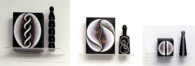
Bottled Histories: Suite No 11, Figures 1–30 2000 (detail) (above)
beeswax, wood, glass, oil, photographs, perspex
Dimensions variable
Courtesy of the artist and Dominik Mersch Gallery, Sydney
© Marion Borgelt Licensed by Viscopy, 2010
Marion Borgelt's Bottled Histories series (above) consists of small artworks that exist as pairs, complementing each other with a related motif or symbol, but having a life of their own as painting and sculptural objects.
Careful thought has been given to relating the shape and size of the canvas to ‘play’ with the shape of the found object, the bottle. Both have been sensitively transformed with wax and paint. The symbols allude to past cultures (an interlaced Celtic symbol), ancient myths and religions (the cross, spiral), the beginning of matter or of the life cycle (seeds splitting), and nature in general. There is a sense of mystery and depth as we glimpse patterns and surfaces below the translucent surface created by the gentle blending of white oil with a top coat of polished wax. Each work is perfect in its symmetry, pattern, fine, even lines, sharp tonal contrasts and subtle shading. They are delicate, precious objects with an allure that works on the viewer's inner psyche. ‘I wish to express the power within the intimate scale, the ability to leave impressions on the memory’ (Borgelt, from an interview with the artist).
Issues/interests: abstraction, spatial relations, precision, symbols, universal significance, life and lunar cycles; main objective to create a balance between conceptual strength and aesthetic sensibility
Forms: sculpture, painting
Frame: Structural in her emphasis on precise technique, sensitivity to materials and use of symbols
Conceptual Framework: Borgelt responds to the world, its structures, patterns and movement. Viewers’ reactions depend on their experiences and levels of perception. The art object entices, puzzles and interacts with the audience, appealing to their minds as well as their emotions. By creating artworks that range from small, fragile objects that can be bought separately or in series, to monumental canvases, commissioned pieces for buildings and site-specific outdoor works, Borgelt has positioned herself within a wide art market.
Bottled Histories: Suite No 11, Figures 1–30 2000 (detail) (above)
beeswax, wood, glass, oil, photographs, perspex
Dimensions variable
Courtesy of the artist and Dominik Mersch Gallery, Sydney
© Marion Borgelt Licensed by Viscopy, 2010
Marion Borgelt's Bottled Histories series (above) consists of small artworks that exist as pairs, complementing each other with a related motif or symbol, but having a life of their own as painting and sculptural objects.
Careful thought has been given to relating the shape and size of the canvas to ‘play’ with the shape of the found object, the bottle. Both have been sensitively transformed with wax and paint. The symbols allude to past cultures (an interlaced Celtic symbol), ancient myths and religions (the cross, spiral), the beginning of matter or of the life cycle (seeds splitting), and nature in general. There is a sense of mystery and depth as we glimpse patterns and surfaces below the translucent surface created by the gentle blending of white oil with a top coat of polished wax. Each work is perfect in its symmetry, pattern, fine, even lines, sharp tonal contrasts and subtle shading. They are delicate, precious objects with an allure that works on the viewer's inner psyche. ‘I wish to express the power within the intimate scale, the ability to leave impressions on the memory’ (Borgelt, from an interview with the artist).
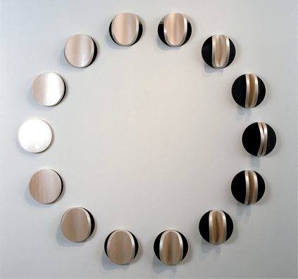
Lunar Circle: Figure D 2007
hoop pine ply, mirror polish stainless steel, pearl oil paint, polyurethane
160 cm (diameter)
Courtesy of the artist and Dominik Mersch Gallery, Sydney
© Marion Borgelt Licensed by Viscopy, 2010
Lunar Circle: Figure D (above) epitomises the themes and concepts
Borgelt has investigated over the years: the idea of the life cycle and its
rhythmic movement, the lunar cycle, the duality of light to darkness, spatial ambiguity, symbolic representations of time passing and metamorphosis, oppositional elements and the beauty of different surfaces. We become aware of
the slow movement and power of the forces of the lunar cycle as a mediator of our day, the tides, our emotions and rhythms. The strong contrast of black against the sheen of the surface adds visual interest and symbolic meaning. Each ‘circle’ creates a unique shadow according to how much the inner circle is bent (the height of the relief) and the position of the viewer. The motto of the Modernist architect Mies van der Rohe, ‘less is more’, can be applied to this artwork, as it is its simplicity, refinement and attention to materials that give it its beauty and symbolic resonance. This concept was further explored in Lunar Warp, and Lunar Circle F 2009, the surface this time covered in broken duck eggshells (grouted, sanded and wax-polished), producing a delicate crackled surface, suggestive of the surface of the moon when partly in shadow.
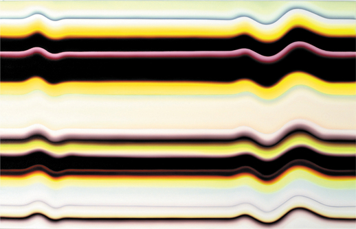
Strobe Series No. 17 2009
oil on canvas
180 × 280 cm
Exhibited at Dominik Mersch Gallery in 2009 (Moonlight in my Veins)
Courtesy of the artist and Dominik Mersch Gallery, Sydney
© Marion Borgeli Licensed by Viscopy, 2010
At first glance, Strobe Series No. 17 gives the illusion that it has been airbrushed or spray painted, but in fact Borgelt is displaying her considerable painting skill, gently blending colours with wide brushes to create
an optical illusion. The surface pulses with energy, suggesting tidal currents, heartbeats, electric pulses, continuous movement that records the passing of time. This is a development from her 2007–08 series, in which lime green and purple (‘adventurous’ colours for Borgelt) predominated. In this work we see the return of her signature red hue, but it has been used as an accent or halo effect and has been blended with more muted pinks and grey combined with the lemon yellow employed in her Liquid Light series. In Strobe Series No.
16 2009, Borgelt has added a 3D rendition of the line in pink, a visual link to the title, as it suggests an engorged vein throbbing.
"The colour reflects a new way of bringing life into my work, getting it to radiate and become active on an optical level. It's bittersweet … I like to hit that point at the edge of bad taste and still get it to work. I also like the nuances, the soft vibrancy as well as the stridency. (Quoted in Laura Murray Cree, ‘Marion Borgelt’, Art World, April/May 2009, p. 100)
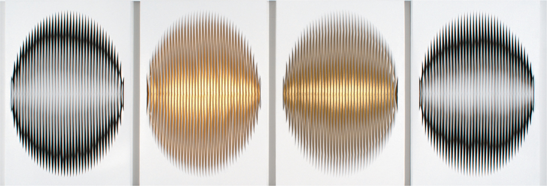
The four canvases of Liquid Light: Gold Eclipse (below), each oval in shape, can be interpreted on various levels. They appear more scientific than natural, but with associations with the eye, the sun or moon, and also to more abstract or universal symbols such as orbs, spheres or voids. As you move, the ‘eye’ seems to blink, a mesmerising effect that links back to Op (optical) art of the late 1960s (such as that of Bridget Riley). This artwork is a continuation of her 2004 exhibition Sol y Sombra in which she used the same technique of a precisely slit and twisted outer layer of canvas that reveals an underlay of another colour. Because the ‘twist’ creates a sculptural relief effect, the amount of underlying colour shown varies as you move. In the outer canvases it is the underlying surface that is ‘coloured’; in the inner two it is the underside of the slit. It dazzles the eye, creating undulating rhythms; adding to the puzzle, the two inner canvases use slightly different golds. In this version she has moved away from the subtle greys of Liquid Light 2007 or her earlier Liquid Light 32 Degrees 2004 in white and pale lemon to these metallic colours linking to the title and theme of the 2009 exhibition (Moonlight in My Veins), as one thinks of the shimmer of moonlight. One of her latest commissions is for Macau's Grand Hyatt Hotel lobby, a work within this series but on a larger scale.
oil on canvas
180 × 280 cm
Exhibited at Dominik Mersch Gallery in 2009 (Moonlight in my Veins)
Courtesy of the artist and Dominik Mersch Gallery, Sydney
© Marion Borgeli Licensed by Viscopy, 2010
At first glance, Strobe Series No. 17 gives the illusion that it has been airbrushed or spray painted, but in fact Borgelt is displaying her considerable painting skill, gently blending colours with wide brushes to create
an optical illusion. The surface pulses with energy, suggesting tidal currents, heartbeats, electric pulses, continuous movement that records the passing of time. This is a development from her 2007–08 series, in which lime green and purple (‘adventurous’ colours for Borgelt) predominated. In this work we see the return of her signature red hue, but it has been used as an accent or halo effect and has been blended with more muted pinks and grey combined with the lemon yellow employed in her Liquid Light series. In Strobe Series No.
16 2009, Borgelt has added a 3D rendition of the line in pink, a visual link to the title, as it suggests an engorged vein throbbing.
"The colour reflects a new way of bringing life into my work, getting it to radiate and become active on an optical level. It's bittersweet … I like to hit that point at the edge of bad taste and still get it to work. I also like the nuances, the soft vibrancy as well as the stridency. (Quoted in Laura Murray Cree, ‘Marion Borgelt’, Art World, April/May 2009, p. 100)
The four canvases of Liquid Light: Gold Eclipse (below), each oval in shape, can be interpreted on various levels. They appear more scientific than natural, but with associations with the eye, the sun or moon, and also to more abstract or universal symbols such as orbs, spheres or voids. As you move, the ‘eye’ seems to blink, a mesmerising effect that links back to Op (optical) art of the late 1960s (such as that of Bridget Riley). This artwork is a continuation of her 2004 exhibition Sol y Sombra in which she used the same technique of a precisely slit and twisted outer layer of canvas that reveals an underlay of another colour. Because the ‘twist’ creates a sculptural relief effect, the amount of underlying colour shown varies as you move. In the outer canvases it is the underlying surface that is ‘coloured’; in the inner two it is the underside of the slit. It dazzles the eye, creating undulating rhythms; adding to the puzzle, the two inner canvases use slightly different golds. In this version she has moved away from the subtle greys of Liquid Light 2007 or her earlier Liquid Light 32 Degrees 2004 in white and pale lemon to these metallic colours linking to the title and theme of the 2009 exhibition (Moonlight in My Veins), as one thinks of the shimmer of moonlight. One of her latest commissions is for Macau's Grand Hyatt Hotel lobby, a work within this series but on a larger scale.
Liquid Light: Gold Eclipse 2009
acrylic, metallics, canvas, timber, pins
95.5 × 271 cm (diameter)
Dominik Mersch Gallery, Danks Street
One can see underlying links in concept, shape and sense of movement (light to darkness, lunar cycles, time passing) with Lunar Circle: Figure D as well as Strobe Series No. 17, but each interpretation has a unique expression owing to the choice of media. Borgelt uses a poetic artistic language of contemporary significance to explore universal symbols of rhythm and nature.
Historical background — biography
Marion Borgelt was brought up in the Wimmera district of rural Victoria. She believes this early experience of living close to nature and seeing the cycles of the land and of nature was formative to her work and her concern for the metaphysics of change. She has studied in South Australia and New York, and has spent long periods in Paris. She travels widely, drawing on these experiences in her artmaking.
Artist's practice
Materials/intentions/display
Marion Borgelt seeks new ways of expressing her ideas and new media and expert artisans to help bring her ideas to fruition. But her artmaking is also cyclical, often referring to past work, so we can see great conceptual strength as she continues to evolve and refine her artmaking. At first her work appears abstract, but we can discover links to nature and culture, a layering of meaning and a tension between forces and surfaces as we discover references to universal symbols, language and life rhythms.
At different times Borgelt has shown an interest in the concept of lightness versus darkness, in life cycles and in the formal imagery of the slit, the void, the cocoon, the strobe and the sphere. However, her underlying strength is in the surface, be it dry-brushed oil overlay on jute, highly polished stainless steel, wax-covered objects or smoky hand-formed glass. She has also transformed found objects such as shoes, bottles and books. Each has a highly evocative, tactile quality and is made with intricate care. They are at times illusive,
with subtle layering or blending of colour. Although her colours are often restricted to one or two per artwork (red, black, white and lemon come to mind), they have a luminous rich glowing presence, creating a meditative quality that hints at psychological and mythical ideas. There is an exploration of dualities and an underlying sense of order and symmetry. Borgelt's artworks appear timeless, bringing together past and future and suggesting the big issues in life, while possessing their own life as beautiful, elegant, refined objects worthy of admiration as well as speculation.
Borgelt is unique in her approach to her artmaking practice. She exhibits in solo exhibitions in leading galleries in Sydney, Melbourne and Perth, while fulfilling large-scale commissions within the landscape in country areas and corporate commissions for commercial foyers, universities and restaurants. She is a well-organised professional artist as well as being highly creative and passionate about her work.
Technique, methods and choices
Marion Borgelt works in a variety of media, scales and forms, carefully selecting each medium according to her intentions in regard to communicating meaning and the relationship with the viewer. When questioned on this subject in an interview in 1999, Borgelt replied:
"Jute has become my trademark, but it also has limitations. I wished to avoid the purely decorative. The dry, hairy, jute surface came from my need and desire to explore the most visceral, organic realm in painting. The jute surface has its own reality and nature … I paint with a dry brush methodology, the paint applied lightly on the surface of the opaque black background. Thus the top layer does not penetrate but sits translucent on top. It breathes and is almost chalky, like a cocoon … hinting at what lies within, preformed matter just taking shape. The white becomes an articulate overlay of containment …
Wax has its own organic nature, it is the most seductive material. It is possible to build it up to create a smooth transparent surface. It has associations with natural preservation, sealing and healing, yet also of civilization — it was used in early Coptic art, signature seals and jam making."
Artist's statements
‘I trained as a painter, but the question in my mind is always “what sort of materials can I use to express this idea?” I really want all the works to have life, but the medium I use will determine what kind of life it has …'
Quoted in Betsy Brennan, ‘Optical allusion’, Vogue Living,
September/October 2007, p. 65.
‘This work requires millimetre precision. I don't need to fill in the centre panels, just the beginning and the end because the template has internal logic. It's an exacting process — I need my assistant here to make sure I don't slip in terms of where I hold the ruler when I am cutting.’
On her use of an assistant for her Liquid Light series. Quoted in Laura Murray Cree, ‘Marion Borgelt’, Art World, April/May 2009, p. 100.
‘I enjoy the dialogue between art and science … order within chaos, the concept of fractals, yet this then leads to disorder (chaos theory). I like to stop at order. My works reflect the evolution of contemporary culture — the binding together of different cultures, styles, belief systems, ways of life to create a melange [medley], a pattern or way of being that is new and different, yet still bears traces of the original sources.’
Quoted from an interview with the author, July 1998.
‘I'm exploring the idea that everything in our lives is in a constant state of flux … We try to find a still point in a turning world …’
On her 2007 exhibition Flux and Permanence. Quoted in Betsy Brennan, ‘Optical allusion’, Vogue Living, September/October 2007, p. 65.
‘Time, change, cyclical movement (in particular, the moon's cycle from new to old, light to dark), the idea of the metronome (a rhythm or pulse) …’
Quoted from interview with author about her main concerns with this 2007 body of work.
‘Abstract painting has greater difficulties on certain levels than figurative painting. The elements are reduced and you have to get them right. In my case, the bands of colour, the edges, the movement, the shifts and changes and the texture all have to be right. Some bands are translucent, some are solid, some shift in a fugitive way, some in a sharp way.’
Quoted in Laura Murray Cree, ‘Marion Borgelt’, Art World, April/May 2009, p. 100.
Referring to her Strobe series
SHORT RESPONSE QUESTION
Examine the way two artists from this chapter have explored the visual qualities and formal elements of art.
Answer this question in the discussion board on the virtual classroom.
For this artist also use the interview and worksheet links below to answer questions on the artist.
You can write this section in one thread on the discussion board or email me.
| interview_for_worksheet_abstraction.doc |
| work_sheet_for_abstraction.doc |
Jonathan Jones
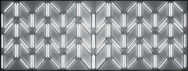
(b. 1978, Indigenous Australian)
Issues/interests: abstraction, spatial relations using lights to create Aboriginal motifs and links with the landscape, a sense of being part of a community
Form: sculpture
Frame: Postmodern — Underlying the formal aspects of his work (repetition and patterning), contemporary technology is used to restate Indigenous pattern making.
Conceptual Framework: The audience becomes involved in the artwork through its large scale and use of light. In these works Jones interprets his world, both past (from his upbringing) and present.
white lines 2005 (above)
fluorescent tubes and fittings
300 × 824 cm
Photo: Scott Strothers
Courtesy of the artist and Gallery Barry Keldoulis, Sydney
white lines 2005 at first appears as a new interpretation of minimalism and the fluorescent light work of American Dan Flavin. There is a formal regularity in the pattern of ‘lines’, but their creation in light, with the
resulting softening of the edges and surrounding glow, adds a new dimension. The open and closed patterns suggest points of tension and connection. The impact is further enhanced when the cultural links are considered. These linear patterns reference the natural patterns of the Australian landscape and Aboriginal motifs as seen in body painting and shields, rock carving and traditional Aboriginal painting, also embodying Jones’ strong ideas on community and connectedness. We are also reminded of humanity's urge to control nature through fire and creating light, and the symbolism of light-as-knowledge and darkness-as-ignorance. This artwork was commissioned by Westpac in Sydney's CBD and was a result of the artist's research into the history of the site.
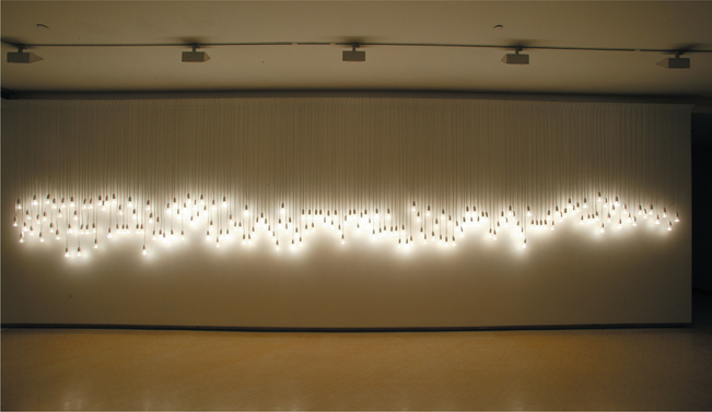
68 Fletcher, Bondi, 20:20, 8.6.03 2003
extension cords, household light bulbs, movement sensors
200 × 900 × 50 cm
Collection: Newcastle Region Art Gallery.
Photo: Paul Green
Installed at Museum of Contemporary Art, Sydney
Courtesy of the artist and Gallery Barry Keldoulis, Sydney
As you walk along the line of dangling lights of Fletcher, Bondi (above), the glow from the bulbs creates an aura or sense of spirituality as the bulbs take on an independent life. The syncopated rhythm of the uneven suspension of lights suggests a dance, or musical notation, with some bulbs in a line like joined notes while others hang lower, stating their individuality. The audience is invited to delve into their imagination in their response to the experience. In fact, the position of the hanging lights represents Bondi Headland three-dimensionally. What at first appears as a simple piece is complex, as the artist has used light to articulate the connection between people and place.
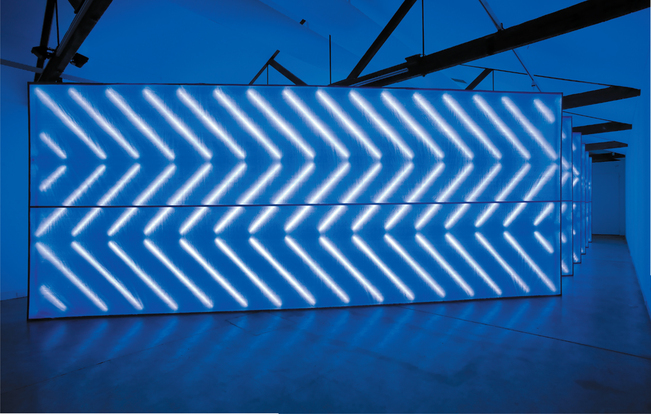
untitled (the tyranny of distance) 2008
aluminium, tarpaulin, fluorescent tubes and fittings
6 walls, each 3.4 × 1.9 × 8.27 m
Commissioned by Sherman Contemporary Art Foundation, Sydney
Courtesy of the artist and Gallery Barry Keldoulis, Sydney
The unifying feature of untitled (the tyranny of distance) 2008 (above) is the relationship between light and space. The blue light extends into the space, which has the effect of dissolving the solidity of the gallery walls,
making the space ambiguous. Jones has made reference to the ‘endless sky’. Installed in the Sherman Gallery Space, its immense size, the glowing lines within the blue structure, its eerie blue radiating into the whole room, entice the viewer to enter and investigate. The multiple ‘walls’, their repetitive positioning at diagonals within the space, draw us in, enfolding and engulfing us, but also suggest by the narrow spaces left and the unnatural light that we are in a ‘forbidden’ area. Yet Jones wants a true interaction with his audience, rather than giving them just a ‘peek through the door’. It is as though he wants us to experience the spaces between things, perhaps to recognise that there is more to understand than is at first apparent (hidden spaces and lost histories come to mind, as well as freedom and the notion of control of movement and intervention).
To experience untitled (the tyranny of distance) you must walk into the small space left along the walls to find the narrow sightlines that have been left between the structures, but you cannot navigate these narrow corridors of blue light. The diagonal spaces echo the diagonal lines of light within the blue tarpaulin. The texture of the tarpaulin, the soft, filtered glow of the neon lights within and the intensity of the blue hold our visual interest while our mind wanders to further associations.
The layers of meaning include a powerful political message. Blue tarpaulins are routinely used on construction sites, but they are also used in temporary shelters following natural disasters. The title alludes to the continuing Northern Territory ‘Intervention’, issues of access and prohibition, and the changing policies surrounding Indigenous housing. It operates as a symbolic statement on the relationships between private and public space, individuals and communities.
Historical background — biography
Jonathan Jones grew up in Sydney and a small town outside Tamworth, moving between members of his extended family. He is of Kamilaroi/Wiradjuri heritage of south-eastern Australia. His grandfather, a Wiradjuri man, had a great influence on Jonathan, not only in his embracing his Aboriginal identity but as an artist.
After dropping out of high school he went to TAFE and to NSW College of Fine Arts. He then worked as a curator at Boomalli Aboriginal Artists Cooperative. In 2002 he was awarded the NSW Ministry for the Arts Indigenous Arts Fellowship and in 2003 his work was included in the Museum of Contemporary Arts Primavera exhibition. He has worked in collaboration with several artists, including Darren Dale and David Page for the Australian Centre for Moving Image in Melbourne and an eight-year partnership with artist and poet Ruark Lewis. Jones currently works at the Art Gallery of New South Wales.
Artist's practice
Materials and intentions
Jones has always experimented with materials at hand, whether Vegemite, corrugated iron or light bulbs. Each of these seemingly mundane materials resonates with personal meaning and metaphor. The blackness of the Vegemite was its appeal, while his grandfather had been an itinerant fencer who frequently found shelter under corrugated iron, that symbol of Australian county life. It was his grandfather who taught Jones how to wire up light fittings. Artificial light has become the focal point or ‘recognisable style’ of his art. Light bulbs
may be suspended side by side or strung in a pattern. Multiple incandescent bulbs in fluorescent tubes may be arranged in repetitive, geometric patterns reminiscent of Modernist Donald Judd. He will often allow the cords and fittings of his lights to show, thus becoming an integral part of the work. The individual units of the pattern suggest a tension, pinpointing, radiating or connecting. These units work within larger structures, an echo of Jones’ upbringing in a fluid yet connected community existing within a wider community.
Connections, links coming together and moving apart, interest the artist. It is this duality of meaning, suggested through the choice of materials and dynamism of the works, that is so intriguing in his practice, which references ancient traditions while promoting understanding and hope for the future.
Jones uses readymade materials not usually associated with art in an architectural articulation of space. He adopts an essentially abstract form that is aesthetically pleasing and conceptually strong while alluding to Indigenous art and humanity in general, articulating how light can pull things together. By working on a large scale he immerses the audience, challenging the viewer to interpret the cultural meanings. By reducing his imagery to geometric abstraction he aims to widen the audience's vision.
Jonathon Jones’ artmaking is ethereal, weightless, yet energetic and visually beautiful.
Influences
Jones has stated that he has been influenced by the Modernist artists Jackson Pollock (Blue Poles) and Tony Tuckson, and that his work untitled (the tyranny of distance), in its use of blue, is a homage to Michael Riley's
Cloud series. There are obvious links to Indigenous art, particularly the notion of ‘brilliance’ or shine — that the more detailed the pattern or Rarrk (cross-hatching), the deeper the spiritual ancestral power the work contains.
Rather than direct referencing, Jones takes a small detail or pattern from an object such as a wooden shield and blows it up into a pattern of lines created with, say, fluorescent tubes.
Artist's statements
‘What [my work] comes down to is trying to capture the notion of a community. It's an idea that perhaps there is one point of light and it's producing a body of light. What if you put another light with it? There's an overlap, a linking …
‘That idea starts to feed into the idea of how we define the question, what is it to be part of the community? To be part of Australia? How do we communicate? How do we operate? We get this notion of the massing of light, but in the end we're all individuals …
‘There are two ideas of culture. Aboriginal and non-Aboriginal culture. There is an overlap even if people don't admit it. At the very least, we're sharing this country so there's an overlap there. People constantly focus on things that are not shared. I'm interested in how we can look at that connection.’
Quoted in Andrew Frost, ‘Afraid of the dark’, Australian Art Collector, issue 42, October–December 2007, p. 137.
http://www.artaustralia.com/emergingartist_jonathanjones.asp - Article on Jonathan Jones
http://www.gbk.com.au/artists/jonathan-jones/revolution - A great webpage on one of his famous exhibitions.
SHORT RESPONSE QUESTION
Conceptual Framework
‘Neon lights along with digital lights are the twentieth century's contribution to the art palette.’ Comment on this statement, referring to Jones and Janet Burchill.
Please answer this question on the discussion board on the virtual classroom.
